Brand Identity, Editorial Design, Naming
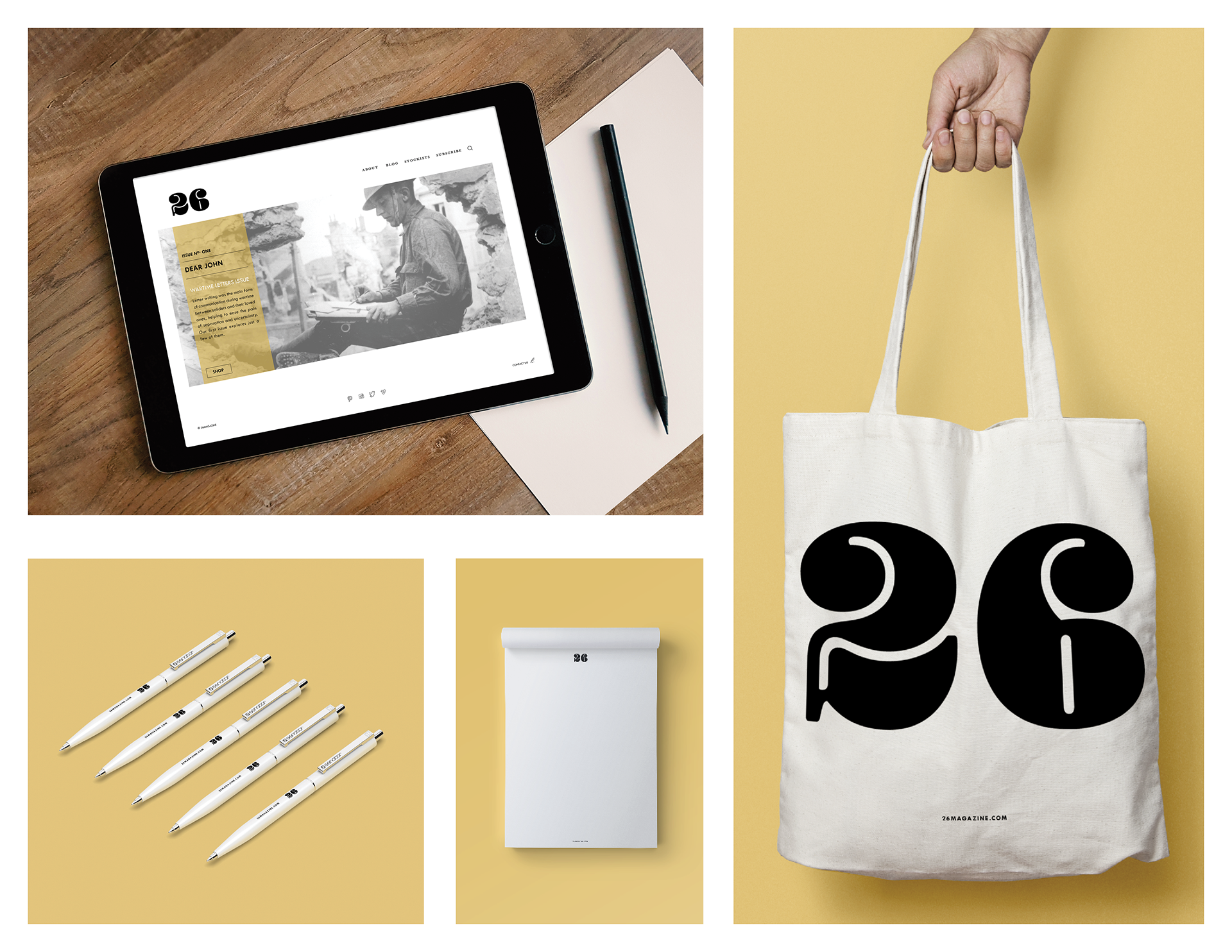
Conceptualized and designed a prototype magazine, website, and promotional items. Named for the twenty-six letters of the English alphabet, the publication '26,' explores the lost art of letter writing. The sophisticated publication offers engaging editorial features with dynamic photography. Each issue is organized around a single theme about letterwriting.
The launch issue focuses on the theme "Dear John" letters received by soldier's sweethearts while in combat. The cover features the '26' logo designed using a bold script-like typeface relating it to penmanship, another lost artifact related to letter writing. The simple yet elegant typography quietly complements the stylized logo. The layout includes a single photograph hinting about the content of the issue. The headlines and articles are based on a minimal yet elegant grid. High contrast photographs and historical artifacts are deliberately infused, reflecting the issue, Wartime Letters
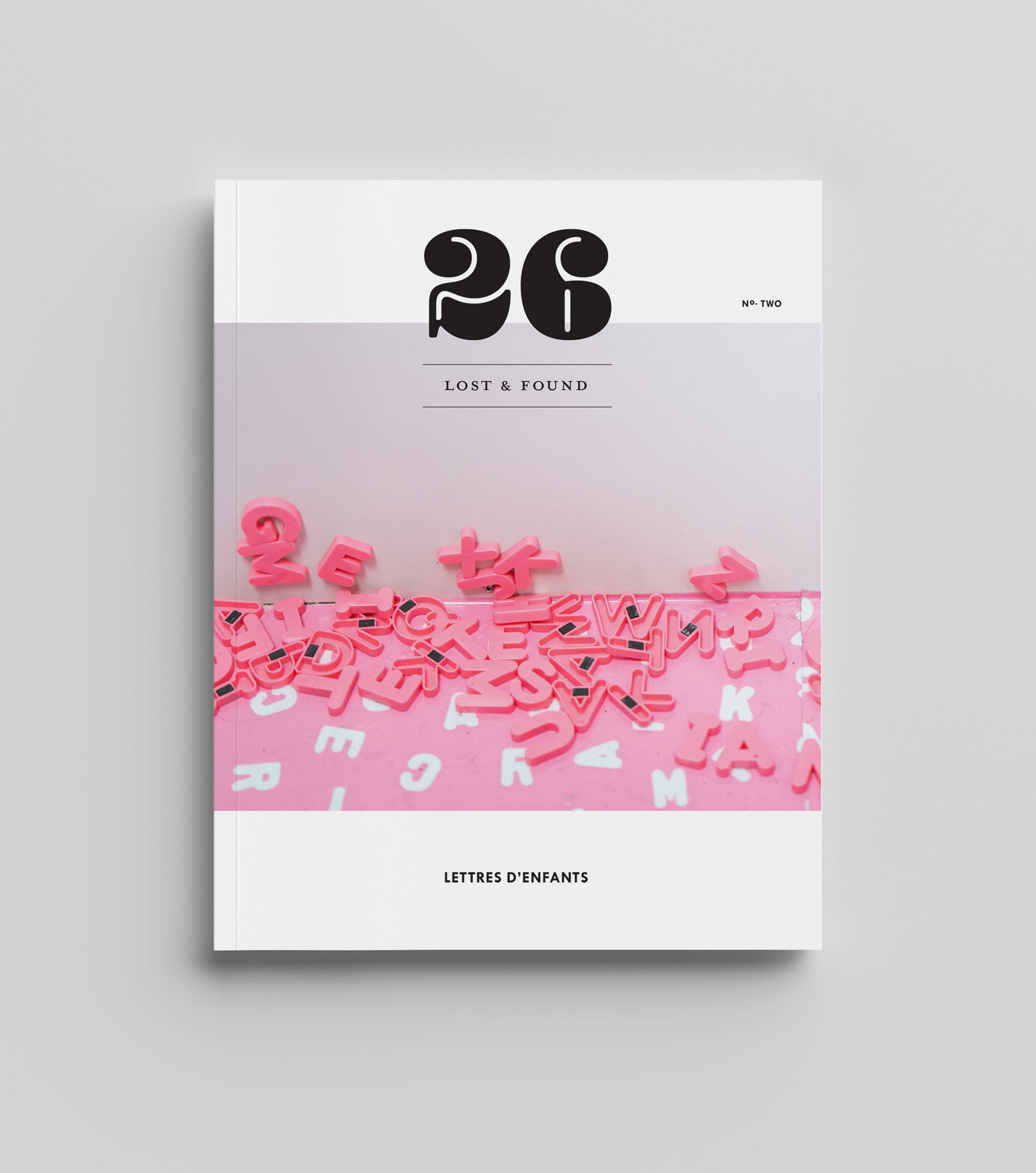
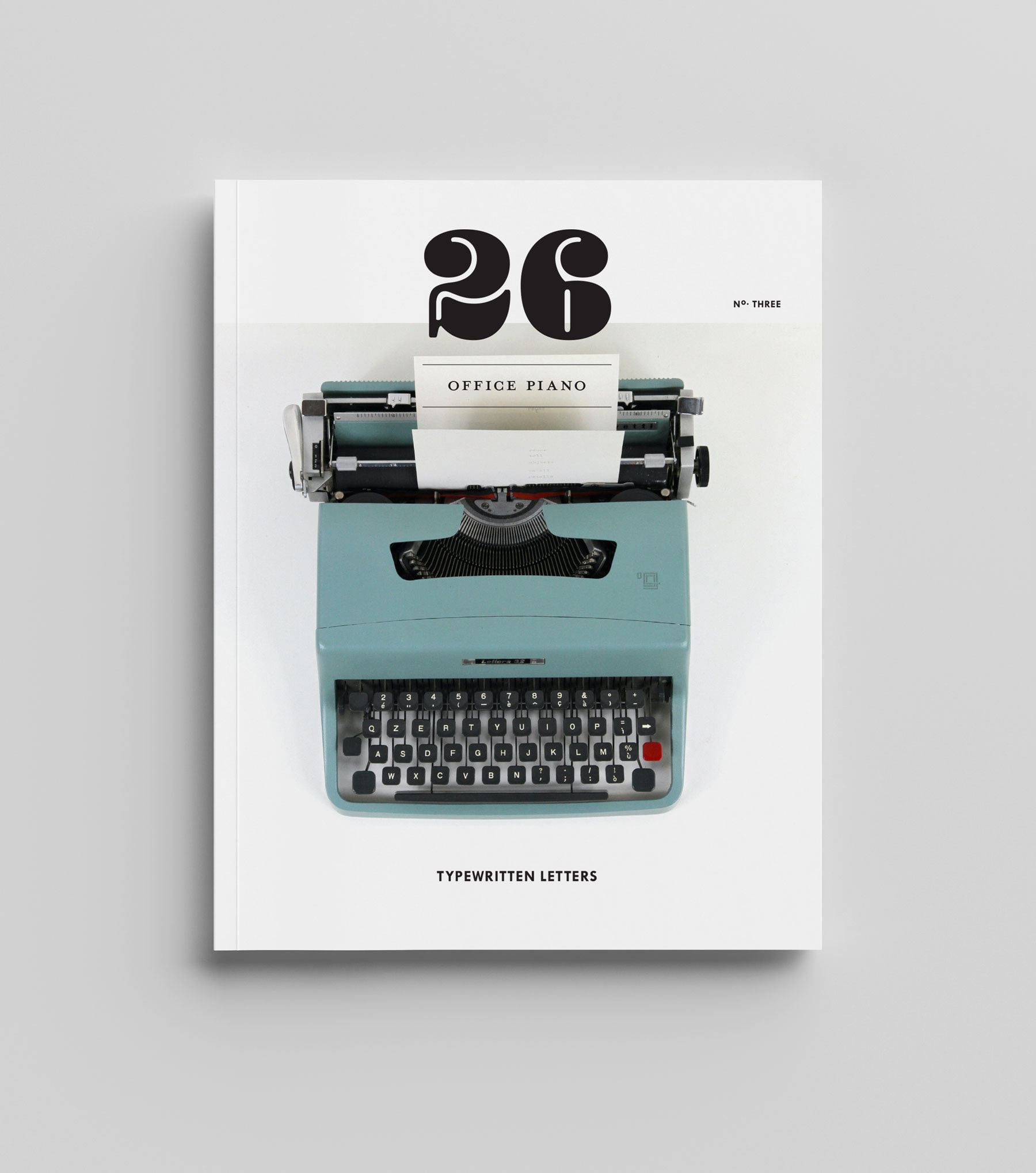
Additional covers were designed to explore possible future themes for the magazine, such as letters written by children and letters produced on a typewriter.